Tuesday, November 29, 2011

Snowy Valentine: My 1st Children's Book: (part 3)


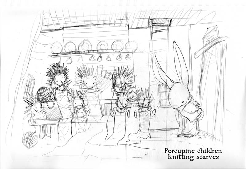
Over the past two weeks I've been showing the process of how my children's book Snowy Valentine came to be published by Harper Collins. (Part 1 & Part 2)What started as a gift story for my wife about a mouse and a cardinal grabbed the interest of an editor and became a story about a rabbit visiting his forest neighbors in an attempt to figure out the perfect gift for his wife. Last week I showed the process of creating the layouts and final inks for the book.


Having finished the inks it was time to move on to color for the final artwork. My editor at Harper was familiar with my Mouse Guard work, but also liked a Wind in the Willows piece I had done in the past. When coloring that piece, I had thought back to the wonderful stop-motion-animation series of Wind in the Willows from Cosgrove Hall and the lovely textures and models used for that series. I manipulated photos of fabric to be in line with the drape and wrinkles of the drawing and tinted and layered them to get the effect I wanted.


Knowing Harper liked that image and since I wanted to do something a bit different with this book than what I do on Mouse Guard, I decided to replicate the technique for the illustrations. With the Willows piece, I used mostly stock photography I found online. For Snowy Valentine, Julia and I went to a fabric store and took photos of various textures, knits, and types of material (we also took a few photos of items around our house). Included in these swatch photos is a photo of our Dog Autumn's tail fur (which doubled as one of the many layers used to make fox fur), a antique glazed pottery (which became the frog's skin), and batting (which became the rabbit's fur).


Here are a few of the finished colored pages which use a blending of my Mouse Guard coloring technique and the various fabric swatches distorted, layered, and tinted.


The last step in finishing this book was the cover. I originally submitted a version of what becomes the first two page spread (the rabbit starting out on his journey away from home). My editors thought (and I agree) thought the blue/purple sky and winter trees made it look more like a Halloween book than a Valentine book (also note at this time the book's title was Snowy Valentine's Day, but was shortened to be less of a mouthful). Various revisions and sketches took place to fix the problem. The editors liked the idea of cloud hearts, and we played with color palette and adjusting the scale of the house. There was also an option to nix the wrap-around cover in favor of a fabric textured back cover with some spot illustrations.


The sketches became rougher and looser as I went forward trying to decide with the editors what image would be the best way to draw an audience in to the book, to convey the romantic theme, the setting, to be wintry and still warm. This series of sketches I did quick color studies for to help us understand what the finished look could be. It was already decided the cover would focus on the rabbit and his bride together, and these sketches narrowed down which pose to use.


And finally, here is the final wrap-around jacket art sans-text:


Snowy Valentine is available now through Amazon or can be ordered by your local bookstore.


Upcoming Appearances:
2012
London Super Con: Feb 25-26
Emerald City: March 30-April 1 
Boston Comic Con: April 21-22

Thursday, November 24, 2011

Happy Thanksgiving!

Tuesday, November 22, 2011

Snowy Valentine: My 1st Children's Book: (part 2)


Last week I talked about Snowy Valentine's origins as a hand drawn book called Mouse & Cardinal gift to my wife. Taking that seven page story and extending it into something more like 30 pages is the subject of this week's post. On a trip to Mackinac Island for our fourth wedding anniversary (2007) I wrote the new plan for the book. Instead of pacing around a small area like the mouse did in my original story, the rabbit would make a trip around to all the other forest critters to see what they were doing for their beloveds on Valentine's Day.

To extend the animal cast I included a cardinal to honor the original story as well as keeping the Fox as a threat to our hero. I added a frog, to pay homage to Mr. Toad from Wind in the Willows, a raccoon in honor of Jesse Glenn's character from Cats Trio, and a grouping of Porcupine children because I thought it would be really adorable. Each character would either suggest a gift or describe the gift they were giving their beloved (none of which seemed to fit for the Rabbit to give his bride).


Once I had the cast in order, and Harper Collins approved the outline, I worked up page layouts for the scenes. I added Lorem Ipsum text (placeholder text in latin) to give me an ide of how much space the text would take up so I could plan for it in the final inks. Here are a few of the pages with the pencil layouts I submitted to Harper Collins along with the final inks once they were approved. The original inks are 12" square for single pages and 12" x 24" for the two-page-spreads.


Next Week: Part 3: Coloring with textures & Cover designs.

Snowy Valentine is available now through Amazon or can be ordered by your local bookstore.

Upcoming Appearances:
2012
London Super Con: Feb 25-26
Emerald City: March 30-April 1 
Boston Comic Con: April 21-22

Tuesday, November 15, 2011

Snowy Valentine: My 1st Children's Book: (part 1)


Over the next 3 weeks I will be posting about the production of my first picture book: Snowy Valentine. November 22nd is when Amazon will ship orders (book stores can stock it, but I'm guessing they won't stock a Valentine's Book until after Christmas). It's surreal and exciting for me to have this book come out. For one, the book's artwork has been finished for almost two years & I haven't been able to share much about it until now. Secondly, I left college thinking that I while I wanted to draw comics, I would be more likely to find work in children's books. It was through the success of Mouse Guard though that led Harper Collins to contact me about the project.

Snowy Valentine started life as the second chapter in a hand drawn book I made for my wife called The Mouse and the Cardinal. The first chapter I drew and wrote about a Mouse (me) and a Cardinal (Julia) who fell in love and were getting married. I gave that chapter to her on our wedding night. I gave her the second chapter as a gift on our first Valentine's Day as husband and wife. Here below is the 7 page story (and cork cover for the book itself)


An editor at Harper Collins contacted me about making it into a longer format children's book. They did say that the mixed species romance should be changed to a single species. They first asked me to change the cardinal to a mouse...but I was a bit "moused-out" with Mouse Guard. Wanting to do something different than Mouse Guard I painted up watercolor samples if both the characters were cardinals. I thought the red bird on the white snow would be graphically striking and it would be fun to use a different media than Mouse Guard


Harper Collins was not in favor of birds as main characters, they wanted something fluffy and furry that a child would want to cuddle with. They suggested chipmunks, voles, and more things too similar to mice for my taste. I came up with rabbits and they agreed it was the perfect choice. This is a test colored sketch of Jasper the male rabbit. I designed him to be more like my Wind in the Willows illustrations that Harper Collins had seen and liked.

Next week: Part 2: Development of the story beyond the original Mouse & Cardinal plot, and the production on the artwork for book.


Snowy Valentine can be ordered through Amazon or your local bookstore.


Upcoming Appearances:
2012
London Super Con: Feb 25-26
Emerald City: March 30-April 1 
Boston Comic Con: April 21-22

Tuesday, November 8, 2011

Dead Duck & LBM:
As a birthday gift for Jay Fosgitt last month, I did this piece honoring a few of his characters & designs: Dead Duck & The Little Blue Men. For Dead Duck, I abanondoned Jay's design to draw the character as if it were a real undead duck. Jay liked that idea when I had sketched the character before, so I knew it would go over well with him again. And riding Dead Duck are the Little Blue Men, the rivals to the main characters in the book Jay drew & wrote for APE: The Little Green Men. The Green guys are tiny alien interpretations of the Three Stooges, so in a moment of brilliance, Jay designed some blue men that are tiny alien versions of the Marx Brothers. I love the Marx Bros. & I think Jay nailed the deigns for those guys.


Mouse Guard Costumes!
With Halloween last week, I wanted to wait for a few last minute photos to come in of all the amazing fans dressed as Mouse Guard characters! Enjoy!


Three ladies at Dragon*Con as Lieam, Saxon, & Kenzie


Nicole Costa sent this picture of her God Daughter as Gwendolyn


Katie Cook & Ryan Wilcox's daughter Grayson as Kenzie


James Mangles as Lieam with the Black Axe


Jeff Hendrickson & his girlfriend as Lieam & Sadie


A very little and adorable Guardmouse.
Upcoming Appearances:
2012
London Super Con: Feb 25-26
Emerald City: March 30-April 1
Boston Comic Con: April 21-22

Tuesday, November 1, 2011

Yesterday's Halloween piece step-by-step: 
For Halloween I wanted to do a spooky Mouse Guard-ish piece which also became a gift owed to one of my nieces (I used commissions as rewards this summer to get them to try new things like different foods and tall water slides). I started this piece with a sketch on some copy paper of skeleton mice sitting on a pumpkin.


Then I took that drawing and scanned it to re-size it and correct some mistakes. The proportions were off on some of the skeletons and I drew the one mouse floating in air, knowing I'd shift him around digitally until I found a good place for him to rest.Like on other pieces I have shown, I'll sometimes tint the mice different colors from the backgrounds or each other. This helps me when the drawing is still light & sketchy to be able to see what lines belong to what subject. This is then printed so I can ink it on the light box...but something wasn't right...

The skeletons, while cool, just didn't have enough life to them. I wanted them to be more otherworldly than just what could have been posed bones. I took my printout from above and a sheet of copy paper and on the lightbox I sketched ghostly mice. I used the bone drawings on the printout as a guide so the ghosts would match the pose and scale of the skeletons perfectly.


The next step was inking. I first inked the piece just like my printed rough, with only the skeletons. I used Strathmore 300 series bristol, and Copic Multiliners for the linework. I was focused on line thickness, texture, and pattern as I inked. Another downside of the skeletons was how easy they are to loose if the background behind them has any detail (the sitting one's legs get a bit lost in the vine and the walking one is hard to make out through all the ground cover.)

I inked my ghostly versions of this trio on the copy paper itself. The copy paper lets the ink bleed a little if the pen sits too long in one place. I used this as motivation to ink these guys more gesturally and less detailed than I normally would. They are spirits after all, I didn't want there to be too much detail to focus on. I added the idea of them evaporating or part of their apparitions to be pulling away from them


I scanned all the inked materials and assembled them as I flatted the piece for color. The flats weer overall quite easy: a sky, the ground, the pumpkin, the vine & leaf, and the skeletons & ghosts. I used a color hold on the ghost & skeleton linework. Trying to get the mice to appear less than solid where you can still see their outlines as well as their skeletons was an exercise in patience and subtle contrasts as I colored the piece.


Without going into too much detail about the ghost process, the ingredients to my solution were color holds, setting a few layers to 'screen' mode, making a few layers with a healthy Gaussian blur, and a subtle outter glow on the linework. The rest of the piece was rendered in my traditional way using the dodge & burn tools to render my flat color areas.The end result was a piece that I think is spooky and fun and will surely make it in to next year's sketchbook (as well as the original making it into my youngest niece's art collection)


Upcoming Appearances:
2012
London Super Con: Feb 25-26
Emerald City: March 30-April 1
Boston Comic Con: April 21-22

Blog Archive