Last Sunday Mondo released a Brave poster I did for their Oscar themed release night. Mondo has a great reputation for working with talented illustrators & designers and terrific production quality on their prints, so I was thrilled and honored to be asked to participate. I loved Brave and took my nieces to see it at their first Drive-In movie experience last summer. When released after Brave won for Best Animated Film on Sunday, the poster sold out in a few minutes (as Mondo prints tend to do). In this week's blogpost (which preempted the normally scheduled Mouse Guard architectural model, now to-be-seen next week) I'll run through the process of creating the image and the tricks in preparing it for the silkscreen process.
 I started with a rewatching of the movie and planning the concept points to be: a scene that seems 'brave', defining Merida's form by her hair, and getting to draw Mordu the villain bear. I sketched up a design and mocked it up in photoshop. Since the orange hair was a planned focal point, I opted to make the rest of the palette in the blue family. I trimmed the piece out with a designey wreath of the wisps and a border used in the tapestry in the movie. With a silkscreen print, you are limited on colors, so I planned to use colors over again. The orange is also the color of Mordu's dead eye, the brown of the ground is also the details of the border, the tan of the bow is the field of the border.
 So it would be easier for me to separate out the colors onto different layers for the silk screen separations, I inked the components separately. The first up was the darkest screen color, the linework of Merida, Mordu, and the ground. Because the final print size is 24" x 36" I wanted to ink this LARGE to minimize any quality loss when enlarging my scans. The inks are 17" x 24" (and had to be scanned in parts since it wouldn't fit on my scanner all at once. The inking was done with Copic Multiliners, a brush for the fills and a brush with liquid white for making the negative space of Merida's hair.
 The next inked piece was the border. I pieced together two different borders from Pixar to get the design to fit the perimeter of my piece. The animals were all from the tapestry in the movie, and to fill in the tall side bits, I found a few tapestry borders they used in some promotional art for the film. I hand inked the border because I wanted the piece to work as a whole and not seem like parts of it were photoshoped together. I wanted to hand distress the design in a way that ties it together with the inkwork on the characters. This piece is also 17" x 24" and had to be scanned in parts.
 I inked other parts of the piece of smaller pieces of bristol like the darker lines of Merida's hair (seen here with round registration points that match up on the bow). Though I could have just processed the art from Pixar, I decided again to hand ink the Brave logo knotwork for the same reasons I hand inked the border. And that strip in the middle...that's a patch to extend the bottom of the original inks...but I haven't gotten to the reason for that yet....
 At this point I processed all my inked artwork and the assets given to me by Pixar and got my file assembled and ready for approval. Pixar hadn't seen my rough, so the 'finished' version was their first time seeing my piece...and they requested changes. Normally, I've found that suggestions given to an artist on approvals for a licensed property are 80% silly and unnecessary. The folks at Pixar though...were 100% right and helped me make a much better finished product. They requested changing the scale of Merida to Mordu, to nix the wreath of wisps into a few ground wisps, to get Merida up higher than the logo (so she's not standing on it), and eliminating the tangent of the arrow on Mordu's lip. To fix this I was able to do most everything digitally (even drawing in some patch hair on Mordu with a Wacom tablet), but the strip of sticks I mentioned before had to be hand drawn to extend the bottom of the image when everything shifted upwards.
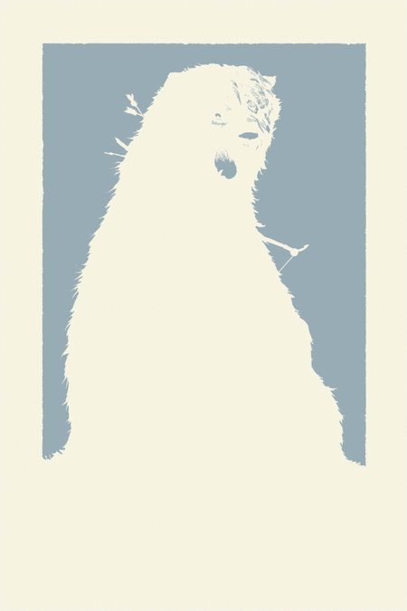 I had a big learning curve on this piece. Not only did I have to re-set my brain to think in terms of limited color, but also about the printing process. The order in which colors are printed and if they need to overlap or not is a real trick to figure out. Colors are generally printed light to dark...but there are exceptions that need to be taken into account there and to make sure there isn't a gap in between colors that butt against each other, the previous color needs to go under the color that will print after it. This is called 'trapping'. I've put together this animated gif of the different layers to simulate what the print looked like as it was silk screened. I hope Mondo will ask me back for another print, as I now feel I have a better handle on the technical process of planning and preparing the art for a silkscreen printing like this.
Here are a few detail images of Mordu & Merida from the final version of the poster:

And another look at the poster in full.
 Watercolor Wednesday: Both last week's and tomorrow's Watercolor Wednesday pieces are exercises in redesign of old characters of mine. First up is something I called Poohbah, which started life as something closer to Genma Saotome in Panda form from Ranma 1/2, and ended as something more like a bear with bunny ears & Mickey Mouse markings. He was a bit of a Hobbes character for a little flying boy named Zippy when I created him (even did some animation in my DOS based Disney Animation Studio program in the 90's). This redesign still holds to the idea that while Poohbah may look like a real creature, he's just full of stuffing.
The 2nd is a redesign of a lizard creature I wanted to do as a puppetry project in the late 90's. These lizard guys would be a party of adventurers in the arctype tradition of fantasy RPGs. I still hope to build some of these puppets some day...
2013 Appearances:
Emerald City: March 1-3
Fabletown Con: March 22-24
C2E2: April 26-28
Spectrum Live: May 17-19
Heroes Con: June 7-9
Albuquerque Comic Expo June 21-23
San Diego Comic Con: July 17-21
*more 2013 dates coming*