Tuesday, September 29, 2015

Fan Art

I love that fans are excited enough about Mouse Guard, Legends of the Guard, or the Mouse Guard RPG (and their player-characters) to lend their talents to creating Mouse Guard Fan Artwork! I share this work from time to time on the blog, so here is a fresh batch of work sent directly to me, or pointed out to me online by other fans.


Corinne Roberts

Dash Xero

Erika Vasos

Ezra Albrecht (age 10)

"Garcifer"

Genevieve Gray

Jacob Cecil

Javier Urena
Mack Sztaba

"Malimar the Mage"

Lea Mai Nguyen

Mick Gray

"Goblinhood"

Nail Sari

Necmi Yalcin

Rosie Ruzicka

Sasha Thompson (a Red Panda-guard)

"Shandria"

Stjep Lukac

"Supercell"

"Tabalus"

Vonholdt


Sam Tan


Talbot


2015 Appearances:
New York Comic Con Oct. 8-11
Art-Bubble Comics Festival: Copenhagen: Nov. 14-15

Tuesday, September 22, 2015

Baltimore Comic Con Yearbook Cover

Every year the Baltimore Comic Con publishes an art book called the Baltimore Comic Con Yearbook where they feature a creator owned property that guests of the show can contribute a piece for honoring that series. This year, I was asked by Marc Nathan if the theme could be Mouse Guard! With this being the 10 year anniversary for Mouse Guard, it couldn't have been better planned. To the left you can see the finished cover art I created for teh book. For today's blogpost, I'll run through the steps and process to get from concept to the final art.
Concept/Sketches: I like to include another animal interacting with at least one mouse for any good Mouse Guard stand alone image. This way the sense of scale is featured, and if the other animal is a predator, establishes the tone of the Guard being brave work for such a small creature. I decided to go back to the 1st interaction ever published for Mouse Guard and drew out a snake vs mouse battle. I also drew eggs hatching little snakes to also pay homage to the offspring Saxon and Kenzie encounter in issue 1 of Fall.

Layout: I scanned the pencil sketches and started laying them out with the specifics of the cover dimensions worked up as a photoshop template (the trim, bleed, space for text, etc). Where the text would go, I dropped in a celtic knot pattern I've used before (on the funeral shroud for Celanawe in Winter). For the background I placed in a photo of a maple branch to see how detailed/minimalist I needed the background to be. I was worried with all the scales, that a detailed background could get too busy, and using this photo as a placeholder helped confirm what I wanted to do.
Inks: I printed out the digital workup for the cover and taped it to the back of a sheet of bristol board. On my lightbox I was able to see through the bristol board to the printout so I could use it as a guide to ink by. I used Copic Multiliner pens for the inks, the 0.7 & 0.3 nibs mainly. On the right you can see the final inks, but below are some of the process shots I took and tweeted as I inked.


Flatting: I scanned the inks back into Photoshop and started to flat the colors in. This is the step of coloring where you are just establishing what areas are which colors. Not to worry about light sources, texture, or shading...just flat colors. I wanted the palate to be reminicent of Fall, and while some of the costume details and the sword are off from Lieam's first appearance, I made the mouse Lieam in every other way to harken back to that first issue in 2005. The border around the text was something I inked seprately on a different sheet of bristol so I could easily isolate it color-wise from the stippled celtic knot on the main image.
Final colors: I rendered the colors using the Dodge & Burn tools in Photoshop, but by using the paint brush tool. After I get the light and dark shading and highlights, I go through and select repetitious forms to tint and adjust so that they look a bit more natural (like the snake scales and the maple leaves).
The Baltimore Yearbook will be on sale this weekend at the Baltimore Comic Con. It will feature new Mouse Guard artwork by Jeremy Bastian, Kelly Yates, Tom Raney, Rich Woodall, Dean Haspiel, Jose Luis Garcia-Lopez, Billy Tucci, Frank Cho, Brandon Peterson, Steve Conley, Thom Zahler, Jeremy Treece, Andy Runton, John Gallagher, Todd Dezago and Craig Rousseau, Jamal Igle, Matthew Dow Smith, and many many more! More info about the book here


2015 Appearances:
Long Beach Comic Con: Sept. 12-13
Baltimore Comic Con Sept. 25-27
New York Comic Con Oct. 8-11
Art-Bubble Comics Festival: Copenhagen: Nov. 14-15

Tuesday, September 15, 2015

Jim Henson's Storyteller: Dragons Cover

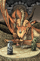
Archaia is doing a Jim Henson's Storyteller mini series with the subtitle DRAGONS. The 4 issue series will have an original Dragon themed story per issue drawn and written by the likes of Nate Pride, Hannah Christenson, and Jorge Corona. I was asked by my Mouse Guard editor Cameron Chittock (who is also the editor for Storyteller) to contribute a variant cover. To the right you can see my finished cover, but below I'm going to share the process for creating the artwork from start to finish.


Pencil sketches & concept: Cam and I chatted on the phone about what to do for the variant. Because Archaia needed this early, none of the issues had been finished yet, so I couldn't base my cover on the interior story of any of the issues...but we still wanted my cover to somehow tie into them. So, I proposed that I'd create a new dragon who is pushing carved dragon pawns around deciding the fates of their real life counterparts. Here is my pencil sketch as well as a lightboxed revision I made to the dragon and the 4 pawns (each representing the designs of the dragons in the 4 issues)

Rough/Pencils: I scanned and assembled my copy-paper pencil drawings in photoshop into a template for the cover. I merged the two dragon drawings and then digitally painted out the setting roughly. The horde of coins gave me a chance to have lots of tiny details...but not really detailed, because they are just repetition of form...and to hide a great deal of Dragon anatomy I didn't want to figure out for this new creature design. The magical chess-board was digitally distorted in from a traditional old magic circle drawing. This is what I then sent off to Cam for him to also show the Henson company for approvals of my concept.


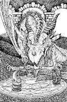
Inks: Once Henson (and Cam) approved my concept, it was time to start inking! I printed out the rough and taped it to the back of a sheet of Strathmore 300 series bristol. On my lightbox I was able to see through the bristol to the printout and use that as my "pencils" as I inked on the surface of the smooth bristol board. I went a little nuts with the coins...I'd originally planned to suggest a great deal of them, but I couldn't help myself once I started. This was all inked with Copic Multiliners (the 0.7 & 0.3 nibs mainly)

Below you can see a number of in-process photos I took as I inked the cover on my lightbox.


Flats: This part of the coloring process is just about establishing the various color areas...that the dragon's skin is a different color than his wing flaps, or eyes, or horns, and that the coins are a different color than the background, etc. I'd already made a great deal of my color choices when I did the rough, so this step was mostly about the kindergarden-like task of coloring the right colors inside the lines....but digitally. At this stage, I also added a color hold to all the linework on the board to make it a bit more subtle.
Final Rendering: The last step is to render, shade, highlight, and add texture to the flat colors. I do most of this using the dodge and burn tools in Photoshop with a textured brush. 


2015 Appearances:
Baltimore Comic Con Sept. 25-27
New York Comic Con Oct. 8-11
Art-Bubble Comics Festival: Copenhagen: Nov. 14-15

Tuesday, September 8, 2015

Art Bubble Festival in Denmark Print

This November, I'll be a guest at the Art Bubble festival in Copenhagen, Denmark! The organizers there asked if I'd create a special print for the festival (as I've done a few times in the past for International visits like the UK and Germany). A good part of my background is Danish (my great-great-grandfather was Johannes who came from Denmark to Michigan). On the left you can see the final print image. In this week's blogpost, I'll be sharing all the step-by-step process for creating it.


I wanted the print's image to be inspired by Danish heritage and symbolism. With an image search, I found the national coat of arms (three blue lions with nine hearts) as well as some fantasy art of Danish Vikings (I can't find any credit for the artist...anyone know). And with the plan of the background being the Danish flag, my version of the coat of arms, and a viking mouse, I sketched out these drawings on copy paper. I only drew 1 lion and 1 heart, as well as just half the crown, planning to use Photoshop tricks to make sure the patterning matched and was was symmetrical.


After I scanned in the copy paper sketches, I composited this rough in Photoshop with a mocked in partial Danish flag. The lions and hearts were color tinted to help me see the different shapes and get a clearer picture of the overall design. Oh, another design note, I saw references to Ermine fur in several other regional danish coat of arms, so I made this mouse's cloak ermine...but to help make that more obvious than just being fur, I decided this was a decorative/portraiture/fancy-dress cloak with the head of the long-dead ermine still attached. I printed out the composite and taped it to the back of a sheet of Strathmore Bristol and started inking it on my lightbox. Below are a few in process photos of the inks


To the left you can see the scan of the finished inks. Because I inked this all on the lightbox, there were no pencils to erase (though I did make an adjustment to the hand holding the helmet that I sketched out on the bristol, so there was a tiny bit of erasing to do). For pens, I used Copic Multiliners...the SP  0.7 and 0.3 nibs. I always try to give my work texture in the inks. Beyond the obvious hatching and stippling, you can see some pattern work and line-type variance: the ring-mail, the cuts on the mouse's head & ears, and the lions & hearts.


With the inks scanned, the tedious job of coloring known as flatting was ahead of me. This is the part where I just have to drop in flat colors (no rendering, shading, or texture) to establish which parts of the image are which colors. on this piece, I did get close to the final colors in the flatting, but there are lots of times I use garish made-up colors as I flat. I added color holds in this step as well. A color hold is where inked linework gets painted in color instead of black.


The exciting part of coloring is all the rendering and detail work. To the left you can see a photo I took of my screen as I was working. For all the shading and highlights I use the burn and dodge tools. When I'm using those, I also use a textured brush (a stock brush called "drybrush") so that it adds a bit of randomness to the work as well as that Mouse Guard-ish pebbled texture.


Here again is a photo of the printed poster art. According to the Art Bubble co-ordinaters, the poster is A3 sized on quality heavy stock. 500 copies have been made and will be sold for 100 Danish Krones ($15) at the Festival in the Round Tower. If there are any left after the festival, Art Bubble is willing to sell worldwide for regular price and postage.

UPDATE: The posters are now available through the Art Bubble website: http://art-bubble.dk/en/print/


2015 Appearances:
Long Beach Comic Con: Sept. 12-13
Baltimore Comic Con Sept. 25-27
New York Comic Con Oct. 8-11
Art-Bubble Comics Festival: Copenhagen: Nov. 14-15

Blog Archive