Tuesday, May 31, 2016

Mouse Guard Coloring Book

Archaia & I have decided to publish a Mouse Guard coloring book! Fans have asked for it, and now one is on the way.

Mouse Guard Coloring Book:
-On Sale: October 2016
-Price: $14.99 US
-96 pages
Preorder on Amazon.com
Or through your LCS using order code JUN16 1233

For this week's blogpost, I will show the process of creating the cover, a piece I designed specifically for the coloring book.


My plan was to to something of a vertical image, with mice and architecture that would be flanked by a design pattern on the left and right (but more on that later). Because the details and little open spaces are what make one of these coloring books, I wanted the mice to have lots of specific clothes and accessories. And the architecture needed to be made of multiple building materials. Here are my pencils for the center section of the cover where on one sheet of copy paper I've drawn the architectural background of a round building with a beehive cupola, and on the other a musician mouse and a Guardmouse with some bees.


After scanning those drawings, I set about making a layout within a template for the cover's measurements (and keeping a space open for the title and text). I assembled the two drawings together, tinting each so that they were easier to 'read' visually as I worked out the design and later when inking on a light box. For the pattern designs up the side, I disassembled a stock stained glass window design, filled the gaps with honeycomb hexagons, and replaced the center floral motif with bees.


I printed out the above layout (I had to do that onto two sheets of legal paper because it was too large to fit on one sheet of anything my home printer can handle) and then taped that layout to the back of a sheet of Strathmore 300 series bristol.

I used Copic Multiliner SP pens (0.7, 0.5, 0.3 nibs) to ink in all the linework and details. I was so focussed on overdoing the details for the coloring book, I didn't think about how tight the linework was and if it would reduce well for publication, so I went back over several areas with white correction paint to open up some parts.


Below you can see several in-process images I posted on Twitter as I worked:


The last step, once the inking was complete was to get the title and byline typeset


Mouse Guard Coloring Book:
-On Sale: October 2016
-Price: $14.99 US
-96 pages


2016 Appearances:

Tuesday, May 24, 2016

Wind in the Willows Jacket Process

The illustrated edition of Wind in the Willows I'm doing with IDW Publishing was announced last week. The Wind in the Willows has long been a favorite of mine. I love talking animal stories and I don’t know that they get better than Kenneth Grahame’s. This has also been a bucket list project for me, something I needed to illustrate before I die. This project started in 2014, and a combination of its intensity as an illustration task and other projects & commitments has led us to a release of Oct 2016.

Pre-Order on Amazon -or- Through your Local Comic Shop using Order Code: JUN16 0571

For this week's blogpost I'm going to detail the process I used for creating the jacket cover (a wrap around, like Mouse Guard books)


Because books are often judged by their cover, I wanted to make sure Wind in the Willows is perceived as an ensemble cast book with 4 main characters, rather than just "Mr. Toad & his Wild Ride". I chose this moment from chapter 6: Mr Toad:
"They reached the carriage-drive of Toad Hall to find, as the Badger had anticipated, a shiny new motor-car, or great size, painted a bright red (Toad's favourite colour), standing in front of the house. As they neared the door it was flung open, and Mr. Toad, arrayed in goggles, cap, gaiters, and enormous overcoat, came swaggering down the steps..."

The sketches for the characters were fairly straight forward. I'd drawn them a few times previously just for fun, so the only decisions I was making was getting postures right for the scene (Badger anticipating Toad's antics, Rat & Mole a bit nervous about them, and Toad strutting proud about them) and locking in on their proportions.


For the setting, I opted not to make a model of Toad Hall, but to do a front facade rough drawing (I only drew half of it and then mirrored it). It's thoroughly based on Mapledurham House, the same house E. H. Shepherd used as reference when  he illustrated Willows back in 1960.


Using my rough, I enlarged and refined the Toad Hall drawing with the motor-car drawn in that I found era-appropriate reference for.  and used the composite of all the sketches as my pencils/layout for the jacket wraparound. Having every character drawn separately allowed me to position them and resize them for scale as I needed. In this step I also planned space for the spine of the book and tested the book's title and bylines. The yellow border was my visual note for where the "trim" line and where the "bleed" are.

I printed that digitally composited layout out on several sheets of copy paper to a size of 22" x 15" and taped that to the back of a big sheet of Bristol. On my lightbox I was able to see through the surface of the Bristol to the printout underneath. I inked using Copic Multiliners. Because this jacket was to also be in color, I didn't render the textures as heavily as I may have if this had been a strictly black & white illustration. Below you can see a few photos I took with my phone as I made my way across the piece:


Once all the inking was done, I scanned the artwork. This took a few passes on may scanner (11" x 17") and some careful re-assembly back in Photoshop. Then I flatted in all the color for the piece. The term 'Flatting' in coloring refers to adding in flat color, no rendering, no effects, just color swatches. This step is like a grown-up version of coloring inside the lines (even when sometimes the lines aren't closed off...so no fill-tool here folks). I'd decided on most of my color choices for this piece before I started (I had previous character illustrations to pull from and the notes from the text as well as Mapledurham House).

I rendered the color in Photoshop using a textured brush and the Dodge (Lighten) & Burn (Darken) Tools. This is done in same way I render any Mouse Guard piece or freelance cover/pinup I've covered here on the blog. In this step, I also established a few color-holds (places where I paint the inkwork to be a color rather than just black) on the motor-car's glass parts and Toad, Rat, & Badger's clothes.


The last step was the Text...but, the Title text needed a better treatment than to just sit on the art. It could easily get lost in the details of Toad Hall above Toad's head, and I didn't want to just apply an outline or shadow behind the type for it to stand out, so I inked a wreath border the type could sit in. I found a stock border to use as inspiration, but then populated the foliage with willow leaves and cat tails. Because this is a separate piece it can be easily removed from the jacket art for use as a stand-alone illustration.


It’s been tremendously difficult to illustrate as I’m trying to live up to the spirit of the original text while living in the shadows of illustrators like E. H. Shepard, Arthur Rackham, Inga Moore, and Robert Ingpen (among many others) who have visualized this tale in ways impossible not to be influenced by. The challenge of doing this story right has lead me to push my work further than I ever have, and I think my artwork will be forever changed by it for the better.


Wind in the Willows can be Pre-Ordered on Amazon 
-or- 
Through your Local Comic Shop using Order Code JUN16 0571


For all my other Willows Process Posts:
http://davidpetersen.blogspot.com/search/label/Willows


2016 Appearances:

Tuesday, May 17, 2016

2016 Bookplate

Every year, for the last four years, I've released a new Mouse Guard bookplate. (You can look over the past years here: 20122013, 2014, & 2015). I started this tradition because fans approaching my table at a convention would be disappointed they didn't have their Mouse Guard books with them for me to sign. By making a unique bookplate every year, I not only make a fun mini-print, but since they are signed, a fan can paste one into their book when they return home and have a signed book.

This week's blogpost is going to be all about the process of creating the 2016 bookplate you see on the left.


When doing a new bookplate I need to think of two important things: The artistic technique and the subject. For the subject I decided to pay homage to Jeremy Bastian's story from Mouse Guard: Legends of the Guard Volume 1.

His story was the only one I was jealous enough of I felt I needed to weave it into Mouse Guard history not just as a legend, but as partial-history. The mouse Silfano became the subject of my bookplate for this year.


Like I said above I also needed to decide on the technique. With past years bookplates being done as embroidery, mosaic, and stained glass, I settled on a realistic rendered pencil drawing (this was also in prep for my Gotham Academy Story released last week). I drew the mouse Silfano on copy paper and the background design (based on Jeremy's panel border) on a toothier drawing paper.


Tool-wise, I used the same stuff I used for Gotham Academy (though technically I drew this first). Knolled here are my (L-R) Stick Eraser, Mechanical Pencil (0.5 w/ HB lead), a Tortillon (fancy word for a smudging stick), and a kneaded eraser. I protected the drawing from getting smudged as I drew, blended, and erased away highlights, by putting down a piece of paper under my hand.


The two drawings were combined after being scanned into Photoshop. To color the image I used the technique of placing layers over the rendered pencil set to layer mode 'color' This keeps the integrity of the value (light/dark) of the drawing, but adds the hue and saturation of what you paint on the 'color' layers to the rendered pencil.

I'll have this bookplate at my 2016 convention appearances, but it is also available in my online shop: http://mouseguard.bigcartel.com/product/mouse-guard-2016-bookplate


2016 Appearances:

Tuesday, May 10, 2016

Gwendolyn Print

Last year I introduced a matted Saxon print to my convention and online store offerings. This year, I've added Sadie. And this week I'm revealing Gwendolyn in her Matriarch Chamber. Below I'll show the full process of the new Gwendolyn print. (finished image to the left)

 The print debut at C2E2 2016, and I'll have it in my online store as well as my other convention appearances.
http://mouseguard.bigcartel.com/product/gwendolyn-print-matted-8x10

I drew this version of Gwendolyn on copy paper. I didn't know what the background should be, but decided since Saxon & Sadie were outside, Gwendolyn would be a good mouse to have an interior architecture background.

I didn't know what interior space to use through. An existing location in Lockhaven, a cool stone arch pattern or window? I didn't go further than what you see here and decided to figure out the background in the next step after I scanned the drawing.

In Photoshop, I was able to size the drawing and crop it to suit the needs of the print. I then tried out a few stock images of arches and windows to get a feel for what would work. I ended up pulling my Matriarch Chamber model off the shelf and photographed a corner of that for the background. In this step I was also able to resize and fix the scale and angle of her pike axe head (which only just enters frame now). The last ting I did before printing this out was to add in a celtic knot pattern I've used on Gwendolyn's tunic before.


Once all that digital tweaking was set, I printed out the layout on my home printer. I taped it to the back of a sheet of Strathmore 300 series bristol. On my Huion light pad I could see through the surface of the bristol to the printout to use as a guide as I inked without needing to re-pencil the drawing. I inked it with Copic Multiliner pens (the 0.7, 0.5, & 0.3 nibs). I avoided inking the stained glass details right up to the lead lines or the tile floor pattern right up to Gwendolyn. This makes isolating those lines for color holds easier in the coloring step.


tweeted this photo I took in-process with my phone as I worked on the piece. I try and establish the major outlines to the character before going in and doing much rendering on any area (though here I did do the cross-hatching in her ear). Before I used Multiliners, I used Uniball Vision office pens. One of the things I think improved when I switched tools is that I became more concerned with varying my line weight. And not just the heavier lines for the outer contour vs the thinner inner lines, but also the change in a given line like the fur around the face or the wrinkles in the cloak.

After I finished inking the piece, I scanned the inks into Photo shop to start coloring. First step of that process is called 'flatting' where you color each part that is a different color with just flat colors and stay within the lines. For the room, I already had a color palette because of the room appearing in The Black Axe. Gwendolyn had also been established color-wise, but I just did my best eyeball match for her fur and clothing colors.


The last step is to render out, shade, highlight, and texture the colors. I use the Dodge & Burn tools with a textured brush to accomplish this.

Again, I'll have this print in my online store as well as at my other convention appearances.
http://mouseguard.bigcartel.com/product/gwendolyn-print-matted-8x10


2016 Appearances:

Tuesday, May 3, 2016

FCBD 2016

This Saturday is FREE COMIC BOOK DAY!!! It's the perfect day to go down to your local comic chop and try something you've never tried before, and ALSO to take along someone in your life who has never stepped foot in a comic shop, never read a comic, or is a lapsed fan of the sequential storytelling. FCBD is such a great way to share what we comic fans love about reading comics. It's free, and most stores put on some kind of promotion, sale, or party too. So it's really fun and worthwhile for new or existing comic fans.

I'll be set up at Green Brain Comics in Dearborn, MI for the day, signing Mouse Guard books (including the FCBD offering this year), and doing free quick Mouse head doodles in anyone's sketchbook.


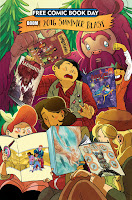
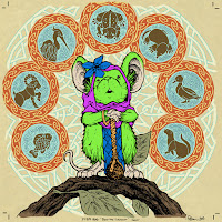
Like I mentioned, I'll have a new Mouse Guard story in the BOOM!/Archaia 2016 Summer Blast issue (again FREE). And for today's blogpost, I wanted to run through the process for creating the 'cover' image for the story (this image is featured on the cover of the BOOM!/Archaia 2016 Summer Blast where one of the Lumberjanes is reading a Mouse Guard issue, but the image also appears on page of its own inside before my story starts.


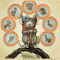
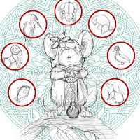
For the layout, I featured my main character for this story 'Piper' front and center.  I surrounded her with knotwork and animal icons with the plan of making this look like illuminated manuscript drawings (like the book of Kells) in the final art. The drawing of Piper was done on copy paper and scanned in to Photoshop where I added in the stock knot-art and some little animal drawings I did separately as well. It looks like I didn't have the stock circle knots around the animals in this saved version of the layout...but I must have added them in at some point before inking.


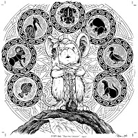
To ink the piece, I printed out the above layout on standard copy paper, and then taped it to the back of a sheet of Strathmore 300 series bristol. Then, on my lightbox, I can see thorough the bristol surface to the printout to use as a guide as I ink. For my pens, I used the Copic Multiliner SP pens with 0.7 and 0.3 nibs. You will notice that the knot designs never tough Piper, this is to not only push them to the background, but also to make it easier to isolate them when I color so that I can pint the linework as a color (a color hold)


When the inks are finished I scan them and start the coloring process. The first step when digitally coloring (other than scanning and cleaning up the scan) is called 'flatting'. The purpose is to establish color shapes (the mouse's fur, the cloaks, the leaf, the animal circles, etc) so that as you render areas you can isolate the parts of the color you want to without affecting the parts you don't want to touch. When flatting, you can use any colors you want, they don't have to be anything close to the final color choices, just so long as the neighboring colors aren't too similar to one another.


Once the tedious job of flatting is done (which is grown-up coloring in the lines), it's time to render, make final color adjustments and finish the cover. To add shading and highlights and texture, I use the Dodge and Burn tools in Photoshop with a textured brush.

To the right is the finished rendered color cover.
Below you will see pencils from a few of the panels from the 8 page story and a un-lettered sample of page 1:


The Tale of Piper The Listener appears in BOOM!/Archaia's 2016 Summer Blast comic FREE this Saturday at your local comic shop.
To find a local comic shop near you:


2016 Appearances:

Blog Archive